This article provides a brief introduction to the
hospitraceR package, which is designed for analysis of
transmission clusters using a combination of whole genome sequencing
(WGS) data and epidemiological information. The package includes
functions for clustering, visualization, and statistical analysis of
transmission clusters. To get started, we will first load the package.
Visualization functions are provided by the companion package hospitraceRVisualize.
We will also load the ape package, which is used for
phylogenetic analysis with the package and in this article, and
tidyr, ggplot2 and paletteer for
data manipulation and visualization.
library(hospitraceR)
library(hospitraceRVisualize)
library(ape)
library(tidyr)
library(ggplot2)
library(ggalign)
library(paletteer)
Loading and preparing data
Throughout, we use an example dataset of carbapenem-resistant Klebsiella pneumoniae isolates and the epidemiological information for the patients they came from. To load it:
# An example dataset of isolates and their patient epidemiological metadata.
extdata_dir <- file.path("..", "..", "inst", "extdata")
load(file.path(extdata_dir, "example.RData"))
We first read in the sequence file, which is a recombination-filtered
variant alignment of the isolates (for more information regarding the
preparation process, see the Methods in Hawken et
al. (2022)). We can read in the sequence file using
ape’s read.dna function:
Now that the sequence file is loaded, we can extract the variable positions in the alignment. We also drop any isolates that do not have a corresponding label in the trace matrix i.e. for which we do not have epidemiological information.
# Get all variable positions in the alignment
var_pos <- apply(dna_aln, 2, function(x) sum(x == x[1]) < nrow(dna_aln))
# Only keep those labels that are in the trace matrix
valid_labels <- dna_pt_labels[labels(dna_aln)] %in% row.names(facility_trace)
We then subset the alignment to include only the variable positions from the isolates with valid labels:
dna_var <- dna_aln[valid_labels, var_pos]The helper function get_snp_dist_matrix() calculates the
SNP distance matrix for these isolates. This is a wrapper around
ape::dist.dna():
snp_dist <- get_snp_dist_matrix(dna_var)Clustering isolates using a hard SNP threshold
Now that we’ve loaded our data, we can start clustering the isolates.
First, we want to use a hard SNP threshold to cluster the isolates. The
get_tn_clusters_snp_thresh() function takes the SNP
distance matrix and a threshold value as input and returns a list of
clusters. We use a threshold of 10 SNPs for this example:
clusters_snp <- get_tn_clusters_snp_thresh(snp_dist, 10)We can then visualize the clusters on a phylogenetic tree using the
plot_clusters_phylo() function. But for this, we first need
to generate a phylogenetic tree. We can do this using the
get_phylo_tree() helper function. We use the maximum
parsimony method for this example:
# Generate a parsimony tree
phylo_tree <- get_phylo_tree(dna_var, snp_dist, "pars")
plot_clusters_phylo(phylo_tree, clusters_snp)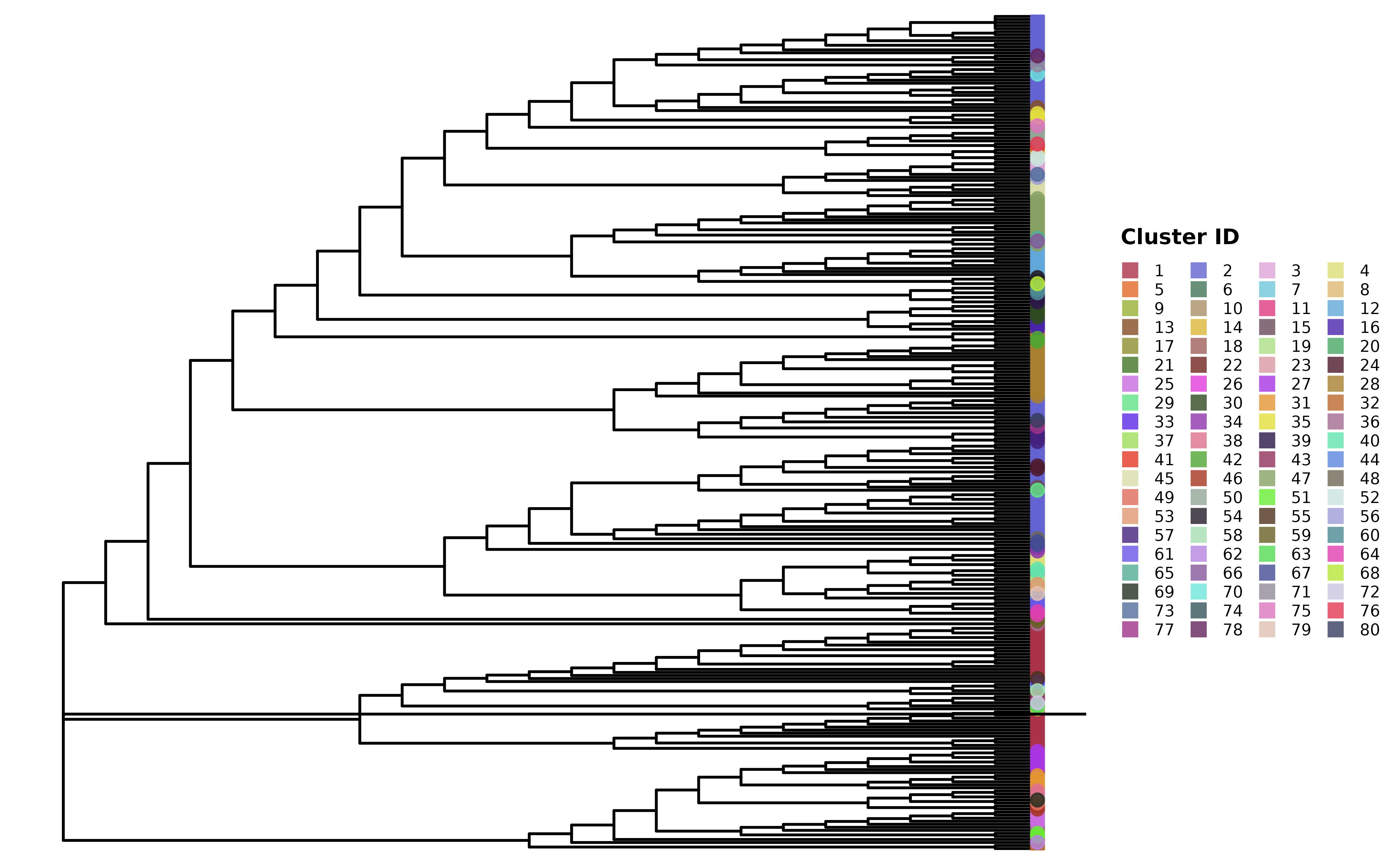
By default, get_tn_clusters_snp_thresh() reconciles the
threshold-based clusters with the phylogenetic tree so that each one is
monophyletic (passing a tree argument uses that tree
instead). This keeps the clusters consistent with the tree, but the SNP
cutoff is still a free parameter that has to be chosen. Next, we look at
the threshold-free approach, which sidesteps that choice by inferring
clusters directly from the structure of the tree.
Clustering isolates using a threshold-free approach
In addition to the hard SNP threshold approach, we can also use a
threshold-free approach to cluster the isolates. The package implements
the method described in Hawken et al.
(2022) in the get_tn_clusters_sv_index() function.
The method uses a threshold-free approach to identify clusters based on
the structure of the phylogenetic tree. We use the same parsimony tree
as before for this example. This function takes in a few more inputs
than the SNP threshold method:
clusters_sv <- get_tn_clusters_sv_index(
    dna_var, snp_dist, adm_seqs, adm_pos_pt_seqs,
    dna_pt_labels, dates, phylo_tree
)
The clusters_sv object contains the clusters identified
using the threshold-free approach. The plot shows the phylogenetic tree
with the clusters highlighted.
plot_clusters_phylo(phylo_tree, clusters_sv)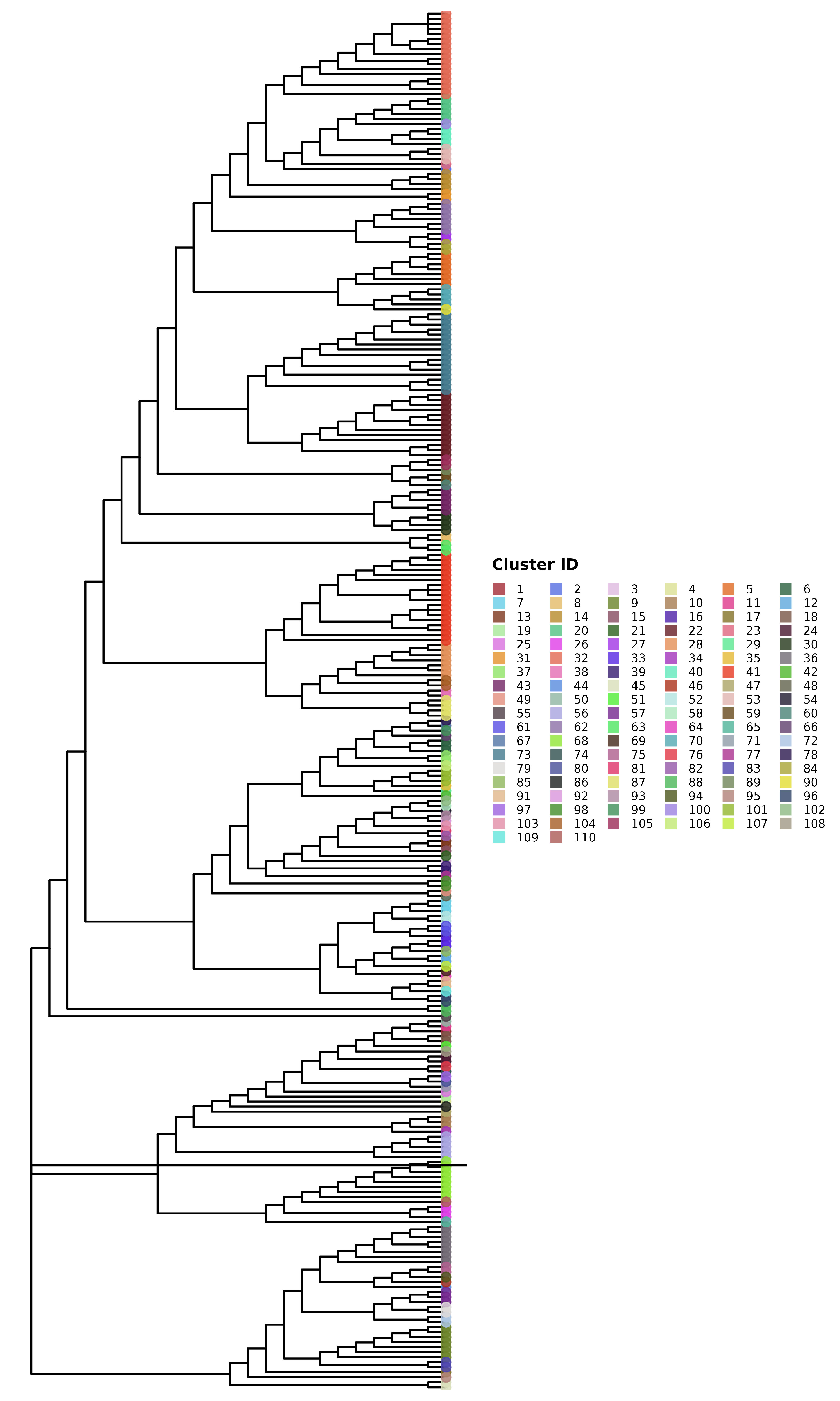
Comparing clusters
These two trees look quite different. We can compare the clusters
generated using the two methods using the
hospitraceRVisualize::plot_jaccard_similarity_heatmap()
function. This function generates a heatmap showing the overlap between
the clusters by indicating the proportion of isolates in each cluster
that are also present in the clusters generated by the other method.
Before we can use this function, we need to remove any singleton
clusters, which are clusters that contain only one isolate — these are
not very useful for comparison:
# remove singleton clusters from both clustering methods
clusters_snp <- remove_singleton_clusters(clusters_snp)
clusters_sv <- remove_singleton_clusters(clusters_sv)

# compare the clusters
plot_jaccard_similarity_heatmap(clusters_snp, clusters_sv) +
    # change the color palette
    scale_fill_paletteer_c("grDevices::Mint", direction = -1) +
    # add a title
    ggtitle("Comparison of clusters using SNP threshold and threshold-free methods") +
    # add x and y axis labels
    xlab("Threshold-free clusters") +
    ylab("SNP threshold clusters") +
    # center the title and rotate x axis labels
    theme(
        plot.title = element_text(hjust = 0.5),
        axis.text.x = element_text(angle = 45, hjust = 1)
    )
#> → heatmap built with `geom_tile()`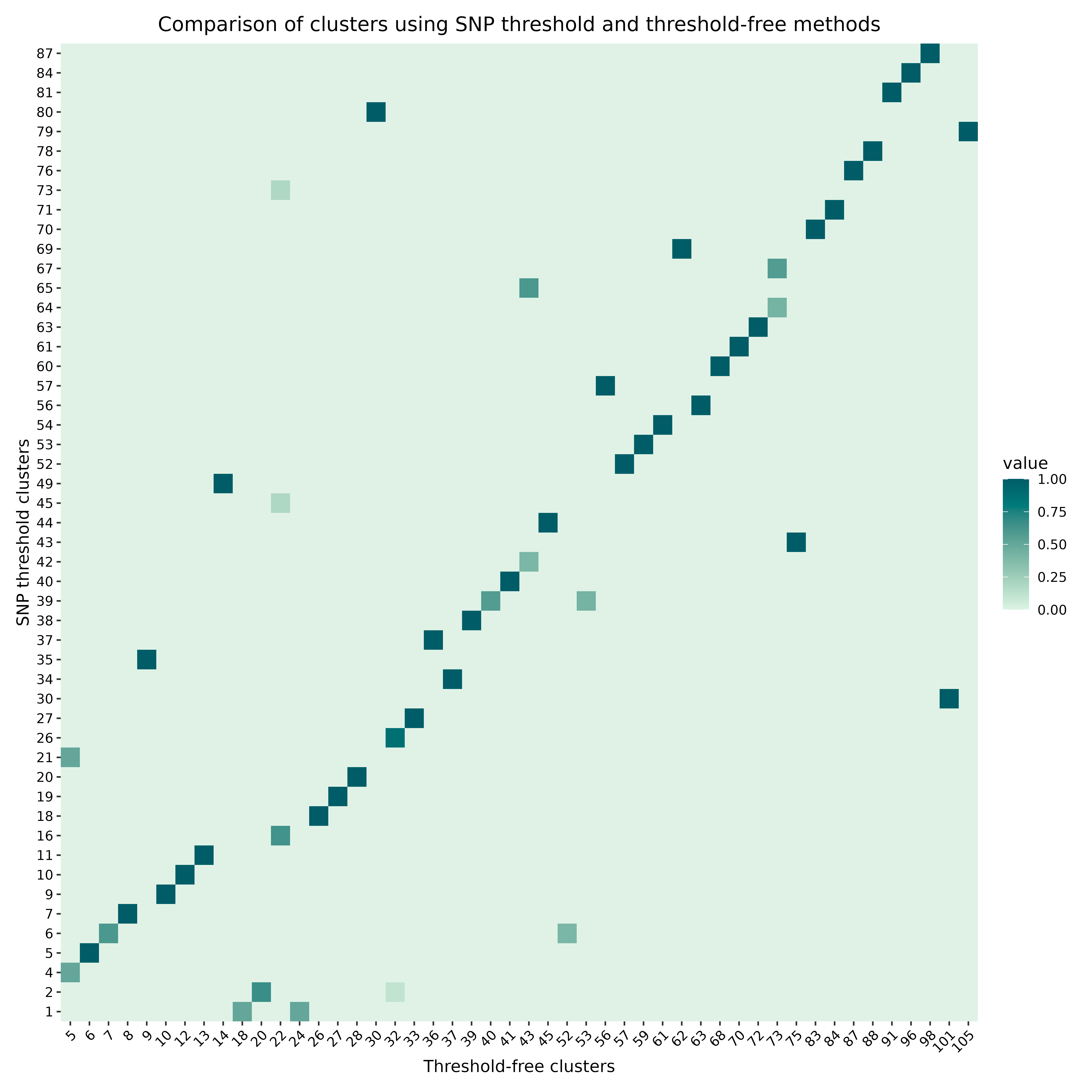
For more information on comparing clusters, see the cluster comparison article.
Genetic distance context of clusters
We can also examine how genetically cohesive each cluster is relative
to the rest of the population. The hospitraceRVisualize
package provides two complementary scatter plots, built on the
per-cluster distance helpers in hospitraceR
(cluster_pairwise_distances() and
cluster_inter_distances()). Both take a vector of cluster
assignments and the SNP distance matrix directly, so we can reuse the
threshold-free clusters and snp_dist from above.
The first compares, for each cluster, the maximum genetic distance
within the cluster against the minimum genetic distance to an
isolate in another cluster. Points below the y = x
reference line are clusters whose internal diversity exceeds their
separation from the nearest other cluster:
plot_intra_vs_inter_cluster_distance(clusters_sv, snp_dist)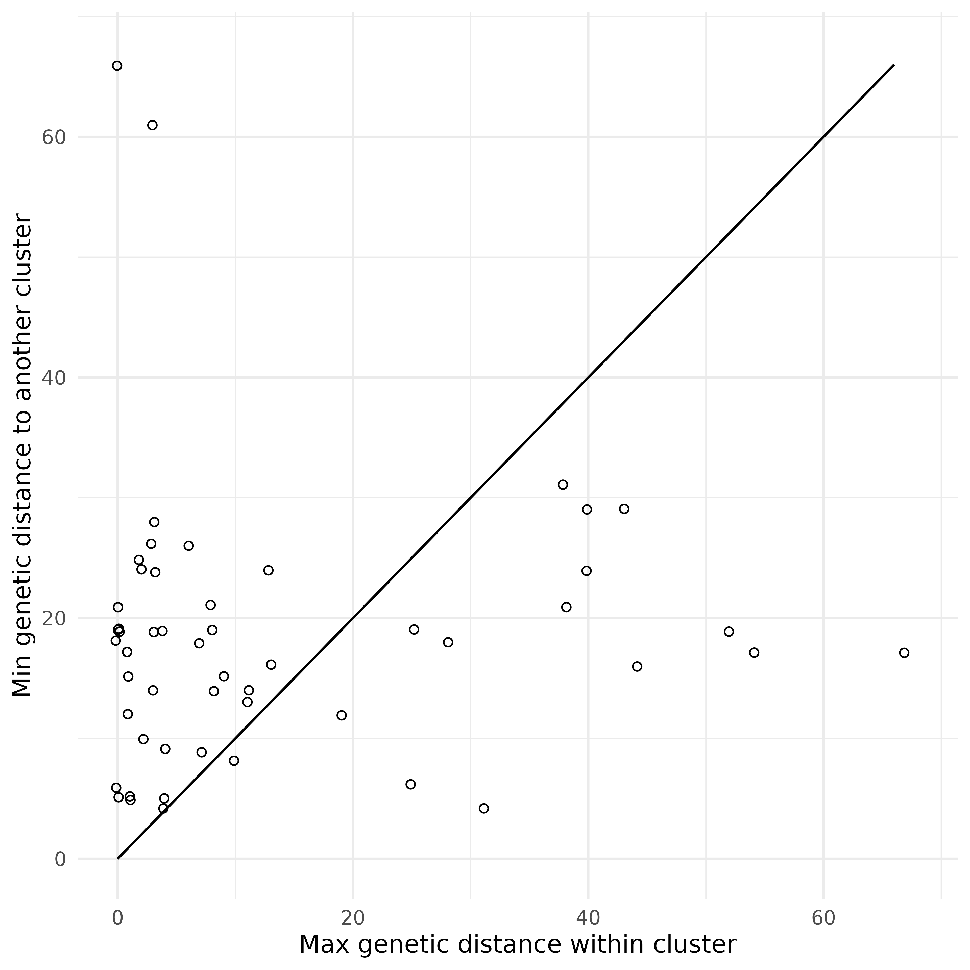
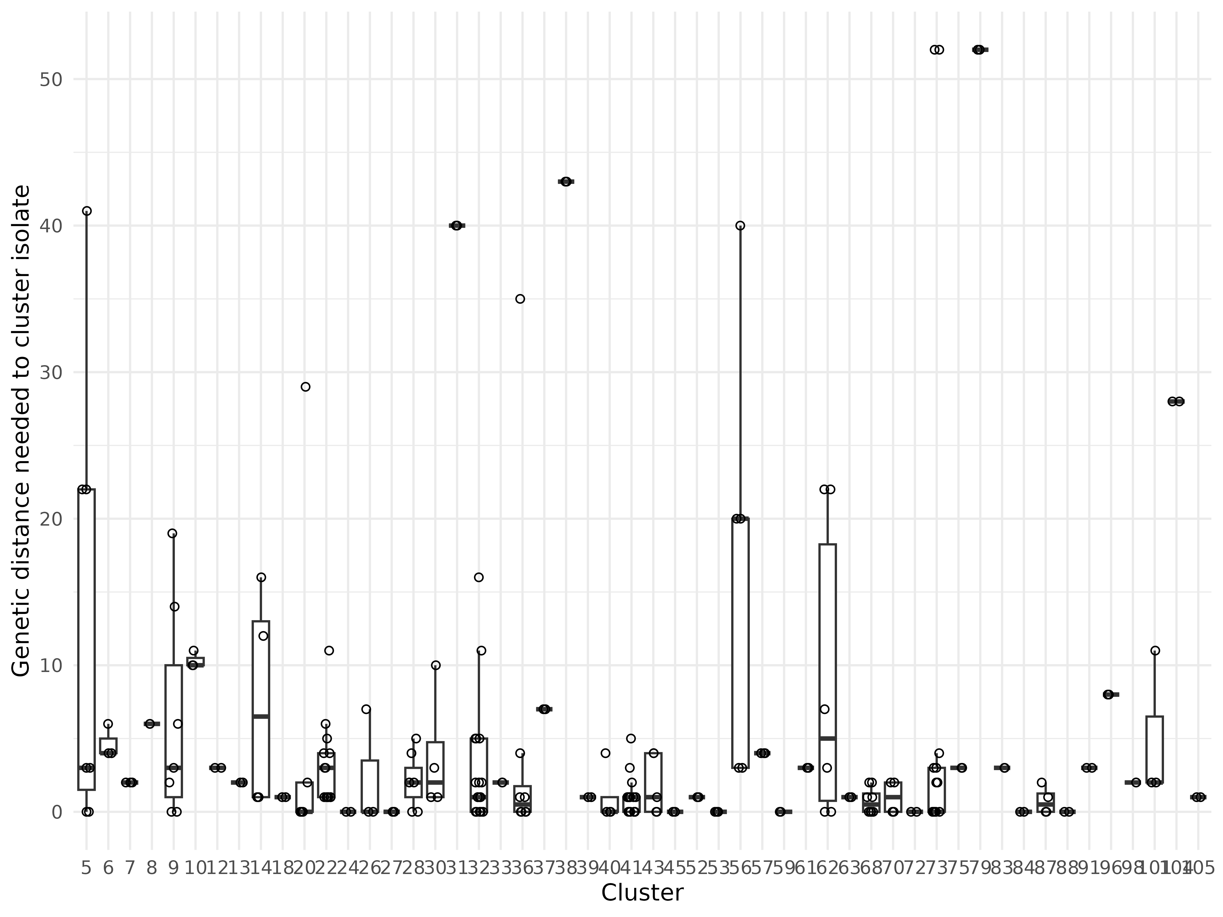
We can also look at the spread of genetic distances within each
cluster on its own. The plot_genetic_distance_by_cluster()
function places each cluster on the x-axis and shows the distribution of
intra-cluster pairwise SNP distances on the y-axis, summarised as a
boxplot with the underlying pairwise distances overlaid as jittered
points. This makes it easy to spot clusters that are unusually diverse
internally:
plot_genetic_distance_by_cluster(clusters_sv, snp_dist)