This vignette provides a brief introduction to the
transclust package, which is designed for analysis of
transmission clusters using a combination of whole genome sequencing
(WGS) data and epidemiological information. The package includes
functions for clustering, visualization, and statistical analysis of
transmission clusters. To get started, we will first load the package.
Visualization functions are provided by the companion package transclustVisualize.
We will also load the ape package, which is used for
phylogenetic analysis with the package and in the vignette, and
tidyr, ggplot2 and paletteer for
data manipulation and visualization.
library(transclust)
library(transclustVisualize)
library(ape)
library(tidyr)
library(ggplot2)
library(ggalign)
#> ========================================
#> ggalign version 1.2.0
#>
#> If you use it in published research, please cite:
#> Peng, Y.; Jiang, S.; Song, Y.; et al. ggalign: Bridging the Grammar of Graphics and Biological Multilayered Complexity. Advanced Science. 2025. doi:10.1002/advs.202507799
#> ========================================
library(paletteer)
Loading and preparing data
The transclust package comes with a sample dataset that
can be used for demonstration purposes. The dataset contains
epidemiological information for a set of isolates. To load the dataset,
we can use the following command:
load(system.file("extdata", "example.RData", package = "transclust"))We first read in the sequence file which has been prepared using the
procedure described in Hawken et al.
(2022). We can read in the sequence file using ape’s
read.dna function:
dna_aln <- read.dna(system.file("extdata", "example.fasta", package = "transclust"), format = "fasta")Now that the sequence file is loaded, we can extract the variable
positions in the alignment. The var_pos variable contains a
logical vector indicating which columns in the alignment are variable.
The dna_pt_labels variable contains the labels for the
sequences in the alignment, and facility_trace is a matrix
containing the trace data for the isolates. The valid set of labels is
determined by checking which labels in the dna_pt_labels
variable are present in the facility_trace matrix.
# Get all variable positions in the alignment
var_pos <- apply(dna_aln, 2, function(x) sum(x == x[1]) < nrow(dna_aln))
# Only keep those labels that are in the trace matrix
valid_labels <- dna_pt_labels[labels(dna_aln)] %in% row.names(facility_trace)
We can then subset the alignment to include only the variable positions from the isolates with valid labels:
dna_var <- dna_aln[valid_labels, var_pos]We then use the helper function get_snp_dist_matrix() to
calculate the SNP distance matrix for these isolates:
snp_dist <- get_snp_dist_matrix(dna_var)The snp_dist variable contains the SNP distance matrix,
which is a square matrix where each entry represents the number of SNP
differences between two isolates. The diagonal entries are all zero, as
they represent the distance between an isolate and itself.
Clustering isolates using a hard SNP threshold
Now that we’ve loaded our data, we can start clustering the isolates. First, we want to use a hard SNP threshold to cluster the isolates.
The get_tn_clusters_snp_thresh() function takes the SNP
distance matrix and a threshold value as input and returns a list of
clusters. We use a threshold of 10 SNPs for this example:
clusters_snp <- get_tn_clusters_snp_thresh(snp_dist, 10)We can then visualize the clusters on a phylogenetic tree using the
plot_clusters_phylo() function. But for this, we first need
to generate a phylogenetic tree. We can do this using the
get_phylo_tree() function. We use the maximum parsimony
method for this example:
# Generate a parsimony tree
phylo_tree <- get_phylo_tree(dna_var, snp_dist, "pars")
plot_clusters_phylo(phylo_tree, clusters_snp)
#> Warning in max(tree$edge.length): no non-missing arguments to max; returning
#> -Inf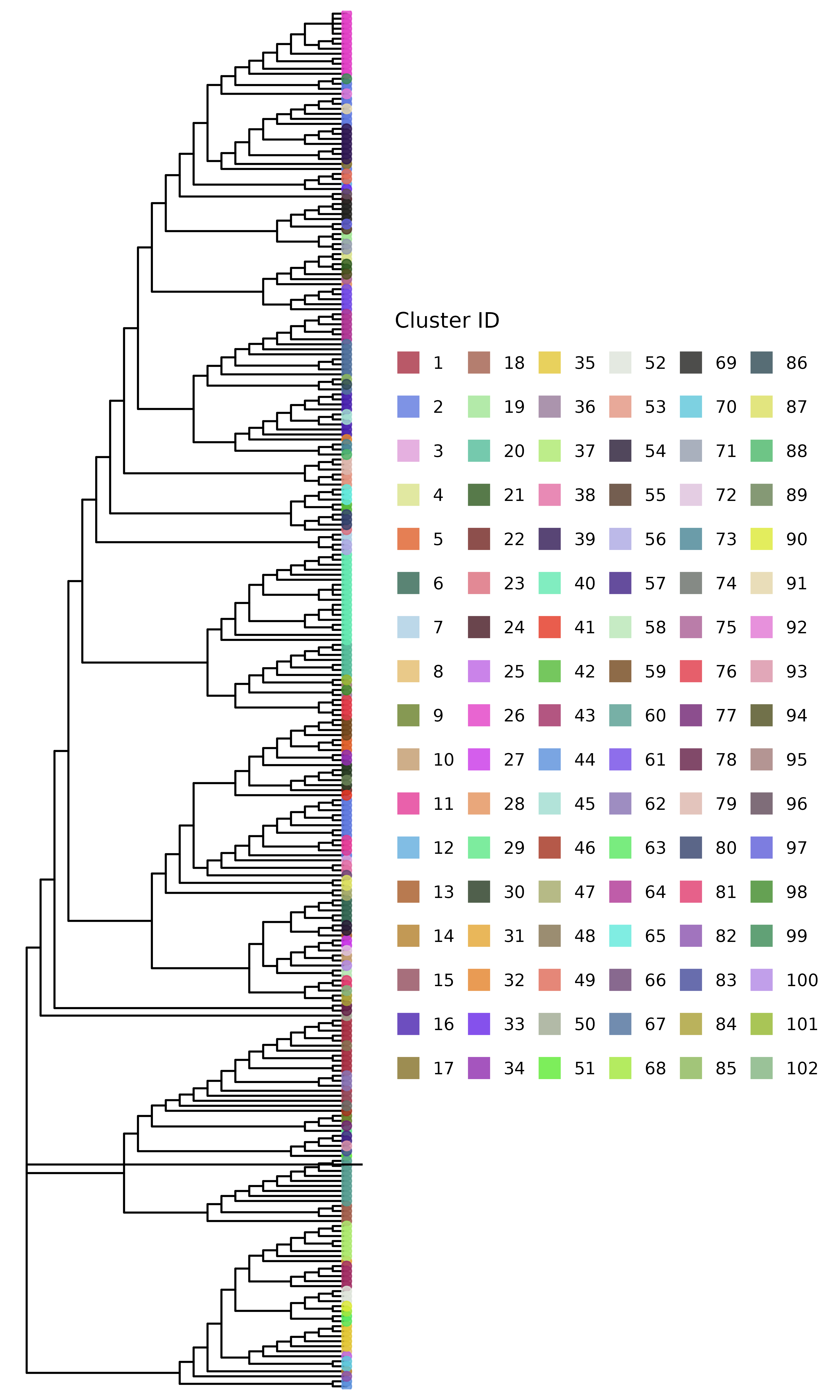
But this isn’t the only SNP threshold approach. This method tries to preserve clusters to be within the phylogenetic tree structure, but we can also cluster the isolates just based on the SNP distance matrix with no regard for the
Clustering isolates using a threshold-free approach
In addition to the hard SNP threshold approach, we can also use a
threshold-free approach to cluster the isolates. The package implements
the method described in Hawken et al.
(2022) in the get_tn_clusters_sv_index() function.
The method uses a threshold-free approach to identify clusters based on
the structure of the phylogenetic tree. We use the same parsimony tree
as before for this example. This function takes in a few more inputs
than the SNP threshold method:
clusters_sv <- get_tn_clusters_sv_index(
    dna_var, snp_dist, adm_seqs, adm_pos_pt_seqs,
    dna_pt_labels, dates, phylo_tree
)
The clusters_sv object contains the clusters identified
using the threshold-free approach. The plot shows the phylogenetic tree
with the clusters highlighted.
plot_clusters_phylo(phylo_tree, clusters_sv)
#> Warning in max(tree$edge.length): no non-missing arguments to max; returning
#> -Inf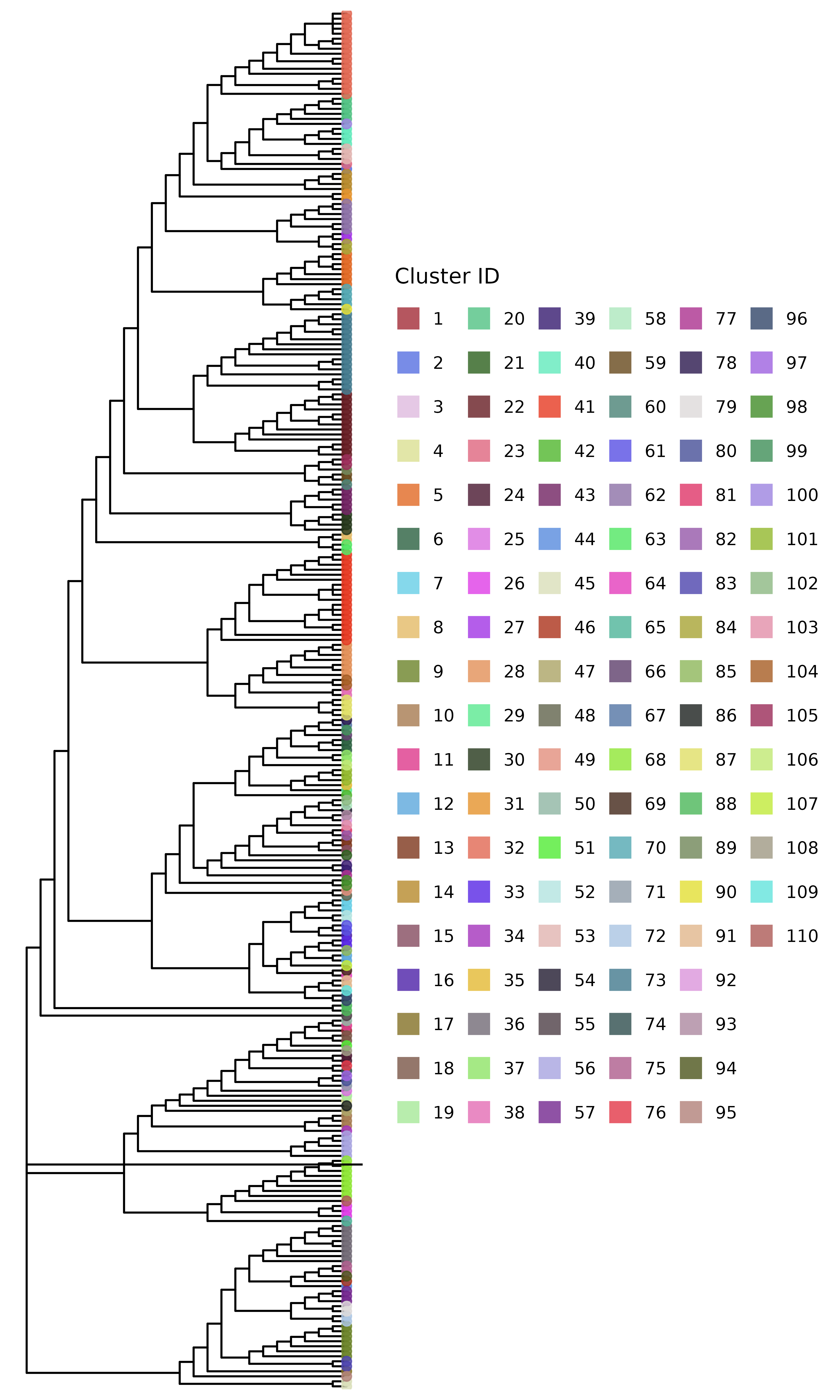
Comparing clusters
These two trees look quite different. We can compare the clusters
generated using the two methods using the
compare_clusters() function. This function generates a
heatmap showing the overlap between the clusters by indicating the
proportion of isolates in each cluster that are also present in the
clusters generated by the other method. Before we can use this function,
we need to remove any singleton clusters, which are clusters that
contain only one isolate – these are not very useful for comparison:
# remove singleton clusters from both clustering methods
clusters_snp <- remove_singleton_clusters(clusters_snp)
clusters_sv <- remove_singleton_clusters(clusters_sv)
# compare the clusters
compare_clusters(clusters_snp, clusters_sv) +
    # change the color palette
    scale_fill_paletteer_c("grDevices::Mint", direction = -1) +
    # add a title
    ggtitle("Comparison of clusters using SNP threshold and threshold-free methods") +
    # add x and y axis labels
    xlab("Threshold-free clusters") +
    ylab("SNP threshold clusters") +
    # center the title and rotate x axis labels
    theme(
        plot.title = element_text(hjust = 0.5),
        axis.text.x = element_text(angle = 45, hjust = 1)
    )
#> → heatmap built with `geom_tile()`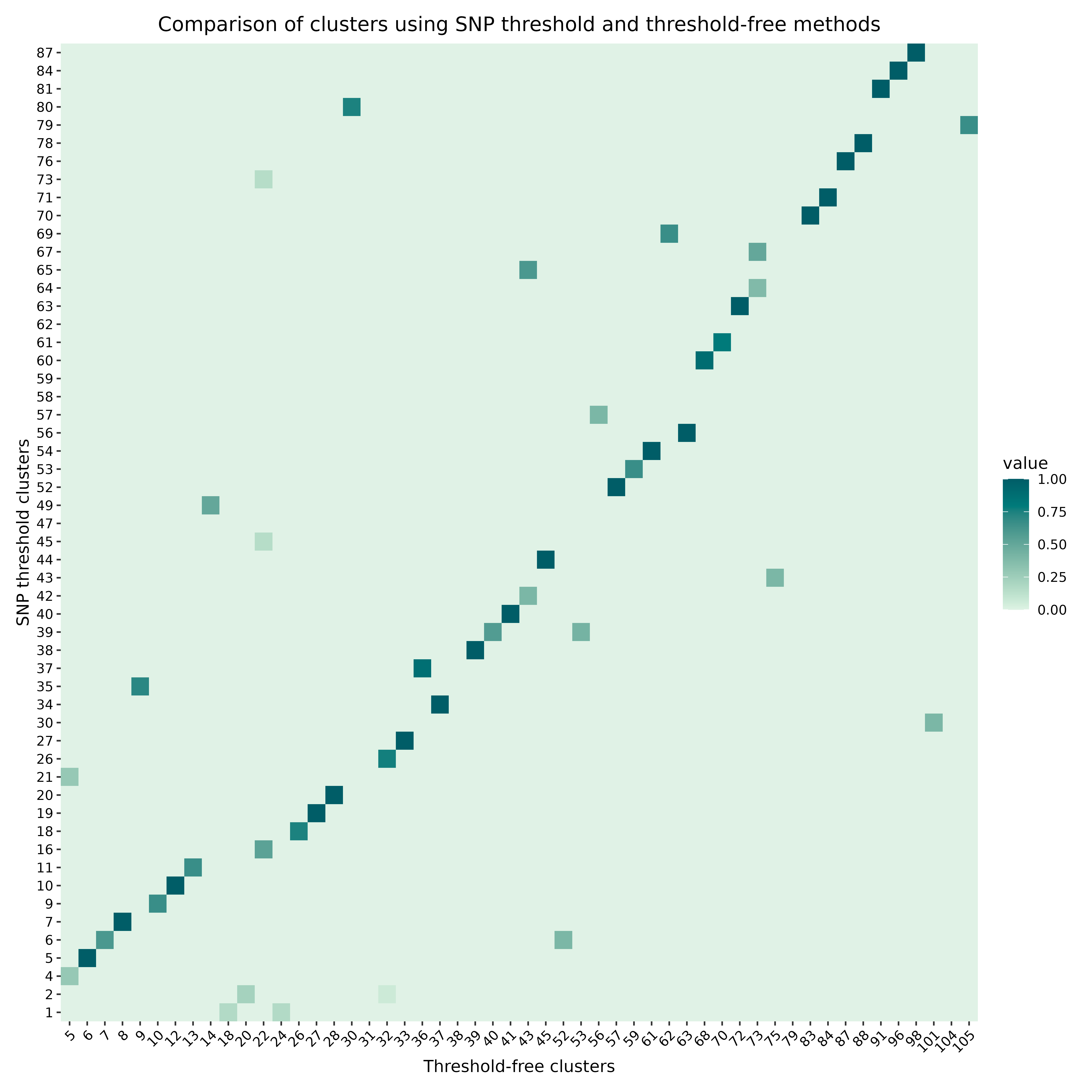
Some statistical analysis of the clustering results
The transclust package also provides functions for
statistical analysis of the clustering results. For example, we can use
the intra_cluster_genetic_var_analysis() function to
calculate the genetic variation within each cluster:
mut_var_df <- intra_cluster_genetic_var_analysis(clusters_sv, dna_aln)This dataframe has columns for the total number of variable sites, and also the proportions of each of the six types of base substitutions present in each cluster. But this isn’t very intuitive to just look at, so we can plot this. First, we drop any possible NA values. For this plot, we only want to compare relative frequencies of the different types of base substitutions, so we also exclude the first column - the total number of variable sites. We further subset the data frame to only include the first few rows for clarity in the plot:
Then we can plot the proportions of each type of base substitution in
each cluster. For this, the ggplot2 package is used to
create a stacked bar plot:
# Add column for cluster using rownames before pivoting
mut_var_df$cluster <- row.names(mut_var_df)

# Convert the data frame to long format for ggplot
mut_var_df_long <- pivot_longer(
    mut_var_df,
    cols = -cluster,
    names_to = "mutation_type",
    values_to = "proportion"
)

# Create the stacked bar plot
ggplot(mut_var_df_long, aes(x = cluster, y = proportion, fill = mutation_type)) +
    geom_bar(stat = "identity") +
    labs(x = "Cluster", y = "Proportion", fill = "Mutation Type") +
    scale_fill_paletteer_d("ggsci::lanonc_lancet")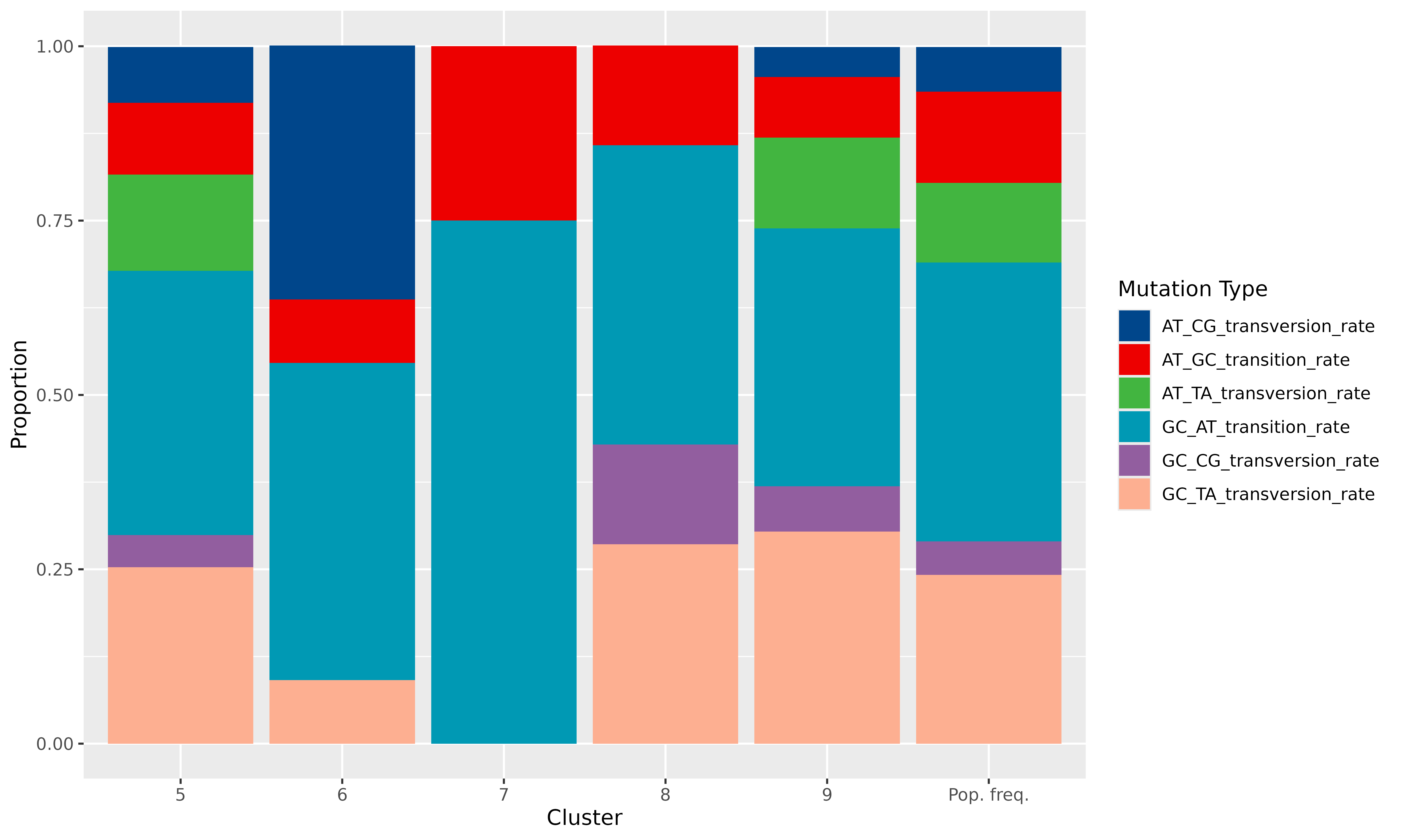
We can clearly see very specific mutational signatures emerge in the clusters when compared to the population as a whole.